03
Design System
From scattered libraries to a single source of truth.
Two years contributing, then governing — across app, customer area, public site, and e-commerce.
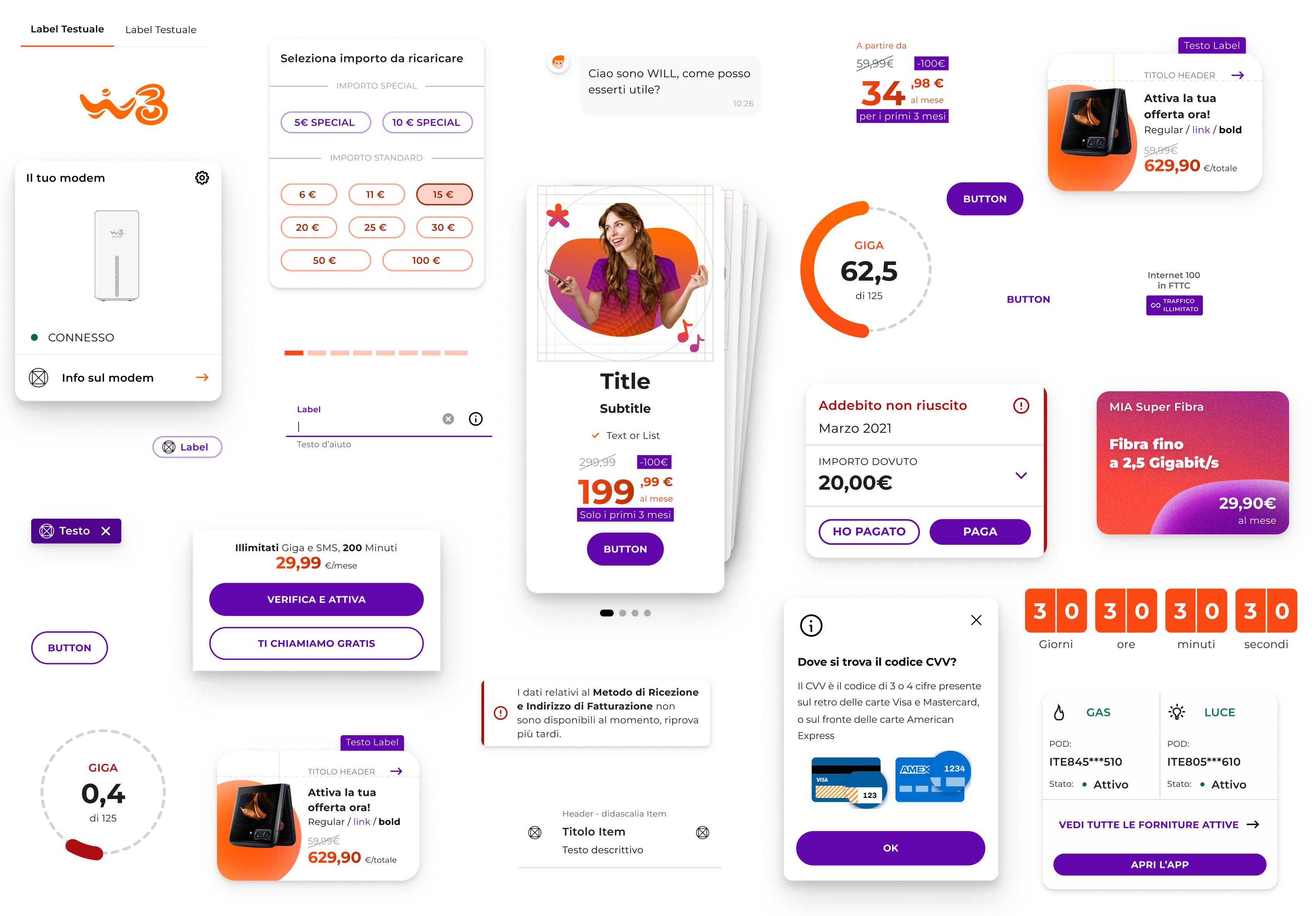
Pieces of the system in production — across four products.
FROM SIX DIALECTS TO ONE COMPONENT
The same component, six visual languages.
The button is the most-used component in any product — and the one most often broken. When I joined, the WindTre system shipped six different versions of it across libraries: same intent, six visual languages.
Two on the same orange family — #FF6900 (2.92 contrast on white, WCAG fail) and #FC4A14 (4.20, fail on body text). One layered the two into a gradient — visually loud, functionally untestable. One tried black on orange — passing contrast, but pulling the button into the visual language of warning states. Underneath, mismatched heights, inconsistent stroke widths, different casing.
Six dialects. One component. No shared truth.
Reconstructed from the legacy libraries — six button variants across app, customer area, and e-commerce. Each one a local optimisation. None talking to the others.
ONE DECISION CHANGED THE SPINE
Orange fails. Purple passes.
WindTre is orange. The brand is orange, the homepage, the devices. The button — the most-tapped CTA in the system — was orange too, and it failed contrast on white. Three options on the table: keep orange and accept WCAG fail. Force black on orange — passes at 7.18, but breaks the brand voice. Switch to purple, the brand's accent color, and pass at 7.78 for free.
Purple won. That single token decision became the spine of every interactive element across the system — every state derived from it, every team's button inheriting from the same source.
Big / Desktop e Tablet
Small / Mobile
Two sizes for two contexts — Big on desktop and tablet, Small on mobile. One 48 px touch target on both — the accessibility floor preserved by the system, not by the designer remembering it.
From that one decision, the rest cascades. The button speaks at three voices — Primaria for high emphasis, Secondaria for middle, Terziaria for low — and each one survives five interactive states. Same tokens, every time.
Primaria
Enfasi alta
Secondaria
Enfasi media
Terziaria
Enfasi bassa
Three voices, five states, one set of tokens. Every emphasis level survives every interaction — automated, not remembered.
The button decision was one token wins for the whole component. The price forced a different decision: the token depends on size. Orange fails contrast on body text, but on large numbers (50 px Bold, 18 px Bold) it passes WCAG as large text. So the system stopped using orange everywhere and started using it where it's allowed to live.
AS-IS
A partire da
Body text fails on orange
TO-BE
A partire da
Orange only where it passes AA
Same component, two rules. AS-IS: orange on every text — the small ones fail contrast. TO-BE: orange on the price (50/18 px Bold passes AA as large text), black on everything below 14 pt. The size becomes the gate.
Two decisions, taken months apart. One on the button color, one on the price typography. Different rules, same place: the token layer. So when an offer card ships, it isn't styled — it's composed. Every value in it already lives in the system.

UnlimitedUnlimited
Giga illimitati in 5G
Nothing here is hand-styled. The purple CTA, the size-gated orange price, the check marks — every token is pulled, not typed. Which raises the real question: where do these pieces live?
ONE GENERAL, MANY DOMAINS
A single source of truth — by inheritance, not by copy.
A single source of truth doesn't mean a single file — it means one authority for every decision. GENERAL holds what every product shares: tokens, brand, the cross-cutting components. APP, WEB and VISUAL— product on mobile, product on web, and the communication layer — inherit from it, then add only what their medium demands. Nothing brand-level is ever redefined downstream — it's inherited.
That's what makes it govern-able: change a token in GENERAL and every domain moves with it. My perimeter was B2C — but the same GENERAL also fed the B2B side (brand and tokens), so the source of truth held across the whole company, not just my corner of it.
One source, many domains. GENERAL feeds APP (the mobile app), WEB (customer area, e-commerce, storefront) and VISUAL (campaigns, social, retail) — my B2C perimeter. The same brand and tokens also reached the B2B side, outside my scope.
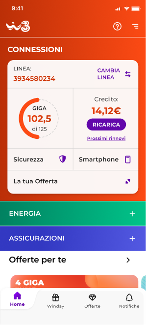
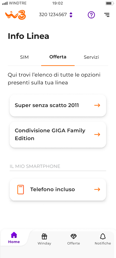
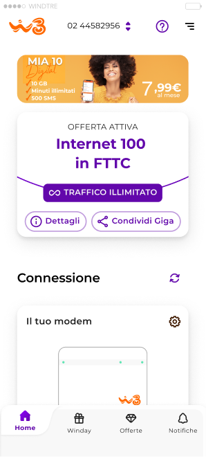
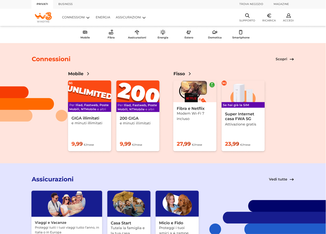
And in production: the same buttons, the same cards, the same hierarchy — adapted to each medium, never re-invented.
THE OLD LIBRARIES, SWITCHED OFF
Migrated, then deprecated — not left to drift.
A new system that runs beside the old ones isn't a source of truth — it's one more dialect. So the legacy libraries weren't archived and quietly forgotten. Their components were migrated into GENERAL, APP, and WEB, and then the originals were deprecated. The win was never the new library. It was switching off the old ones.
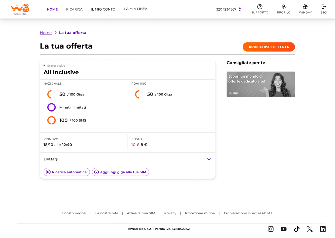
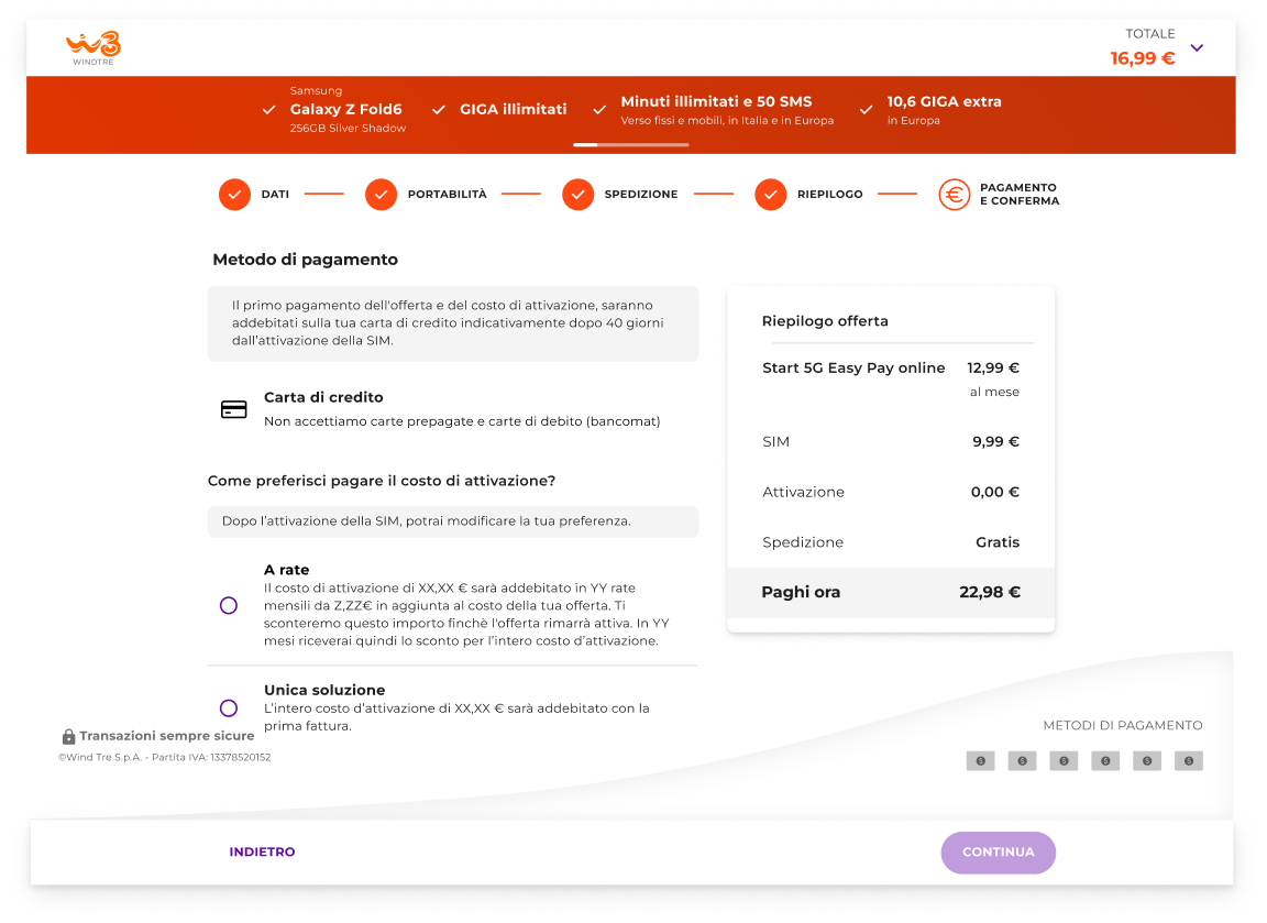
Two years on a single client — not as the sole author, but as part of the design-system team that owned this hierarchy and governed what was allowed into it. From one recharge flow to one source of truth across four surfaces, the work stopped being “design the screen” and became “improve the foundation every screen stands on.”