01
Top-up flow
When a feature becomes a foundation
Designed in 2021. Live today, used by ~20M WindTre customers.

Recharge on web and mobile — same product, same system.
THREE PROBLEMS, ONE BROKEN EXPERIENCE
The recharge flow had three distinct but interconnected problems — each one damaging the experience in a different way.
A flow problem
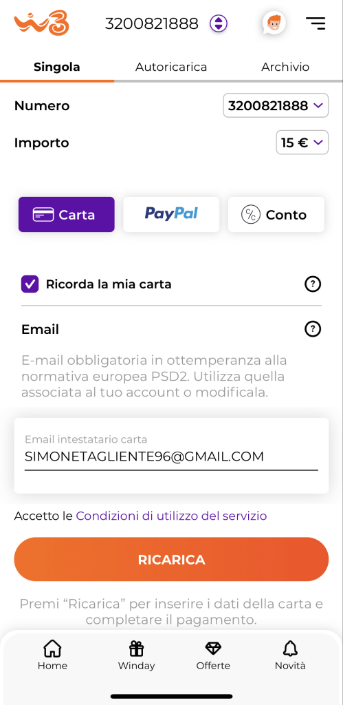
Recharge screen — CTA always active, no review step between tap and transaction.
An accessibility problem
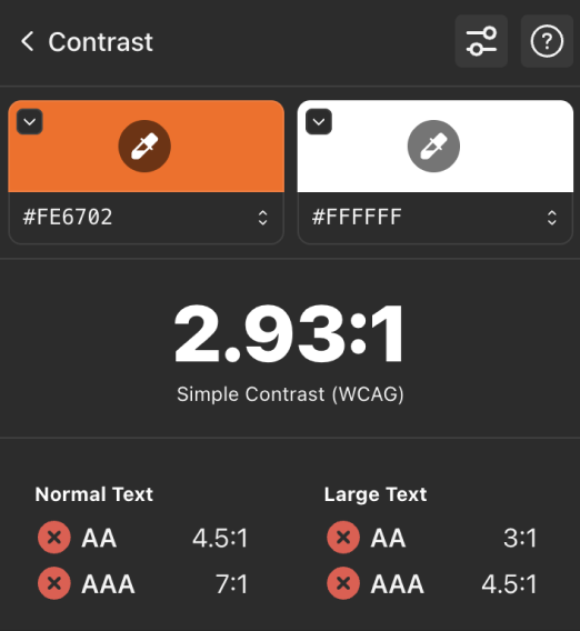
Primary orange CTA — Stark contrast check
A usability problem
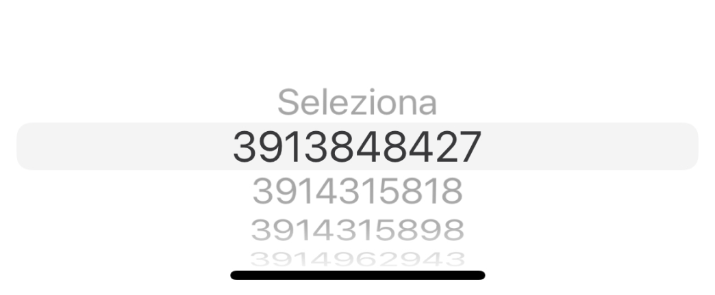
Phone number picker — sub-44px targets, docked at screen bottom, four items visible.
Underneath, web and mobile had evolved independently. Same product, but completely different components, visual language, and interaction patterns.
The cover at the top of this case is the after — same chips, same primary, same system.
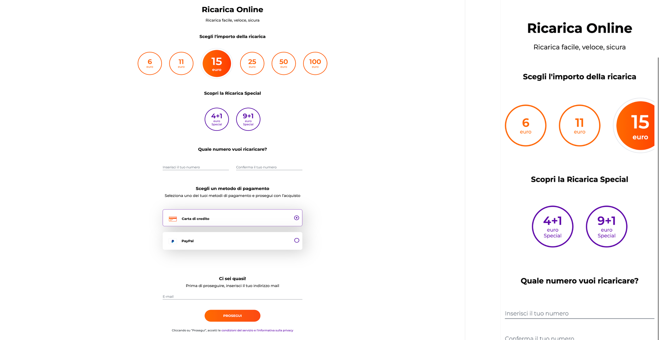
Ricarica Online — public web, same product, different design
KEY DECISIONS
Three design moves, each one closing a problem and setting a new standard for the system.
Moving primary CTAs to purple
Orange fails WCAG AA on white — it's a physics problem, not a style choice. Rather than fight the brand colour, primary actions were redirected to purple, WindTre's secondary colour that passes contrast requirements.
Orange wasn't removed — it was disciplined. Darker tokens for text, reserved for contextual moments like warning states where its visual weight carries meaning. This decision seeded a broader refactor — the full semantic palette that later shaped the system's states.
Premi “Ricarica” per inserire i dati della carta e completare il pagamento
2.93:1 FAIL
Premi “Ricarica” per inserire i dati della carta e completare il pagamento
9.82:1 PASS
Chips for amount selection
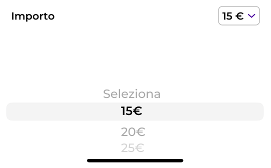
Dropdown opens iOS picker — same fat-finger problem
Seleziona importo da ricaricare
IMPORTO SPECIAL
IMPORTO STANDARD
Introducing a confirmation modal
Confermare la ricarica?
Stai per effettuare una ricarica di 15€
SYSTEM IMPACT
The recharge redesign didn't end at shipment.
Same chip, same modal, same primary — across Singola, Autoricarica and Con codice.
Three decisions — chip-based selection, confirmation gate, purple primary — held across all three top-up variants. The a11y check joined the Definition of Done. What started as three fixes for a recharge flow became three rules for the system.
And the next surface picks up where the system left off.
02
Widget iOS
Bringing the answers out of the app.